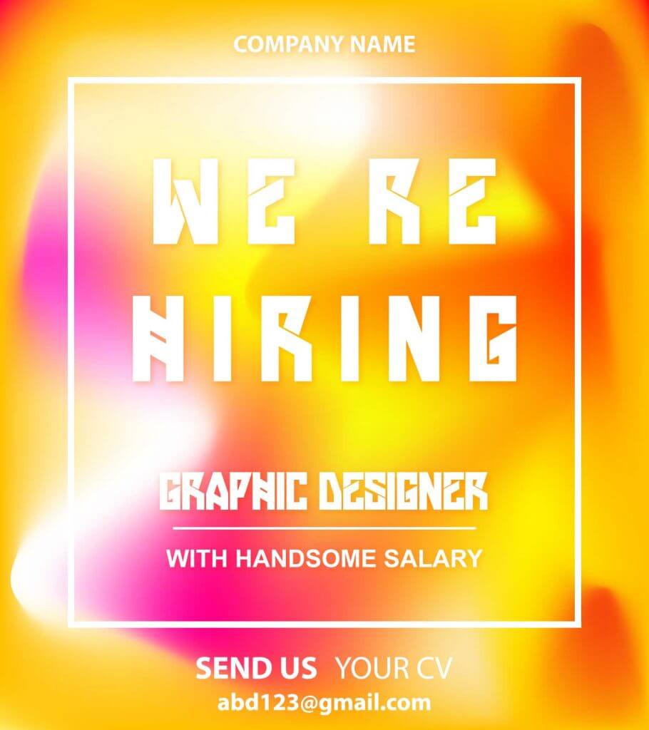
A hiring poster is a common type of poster used for the hiring purpose for every small and large company. A thousand poster templates are available online and this makes the companies plug and play. We may also apply our imagination to convert a common poster into an amazing series of plays. This article would teach you how to use Adobe Illustrator to design a hiring poster with fluid color.
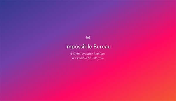
Fluid color design is a famous type of design trend which applying gradient between two or more colors to generate a visual impression. A gradient often known as color transformations is a progressive transformation of color to light whether you’re in a vibrant mood, from color to light to color, and basically it is not limited to two shades.
Create a Fluid Color Background
First, we need to draw a rectangle using a rectangle tool until it satisfies the size of the artboard. The size of the artboard may be modified depending on your requirement. So we fill a color into the object in the rectangle. An orange color is applied as our principal color in the rectangle.
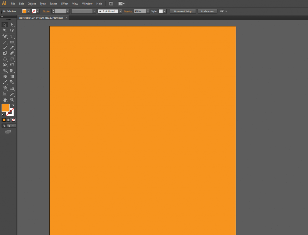
I guess some of you knew what’s to do next.
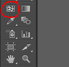
Yes, we are going to apply a tool called a Mesh Tool! It shows up as a box of rectangles with inside few curve lines. To turn to it, click on it or simply press ‘U’.
We’ll then click and place a grid point at the object in the rectangle. Three grid dots are placed on the rectangle and displayed as the figure below.
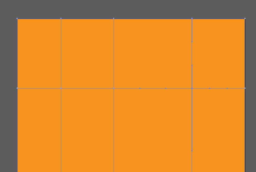
So you can select a grid point and fill it with colour. Note that the Gradient Mesh Tool only allows one grid point to be picked at a time. If you want to add the same color to more than one level of the grid then use the Direct Selection Tool. After clicking the first grid level, keep down the Shift key to pick another one.
The rectangle ‘s gradient color will be similar to the figure below after each grid point has the color filled in.
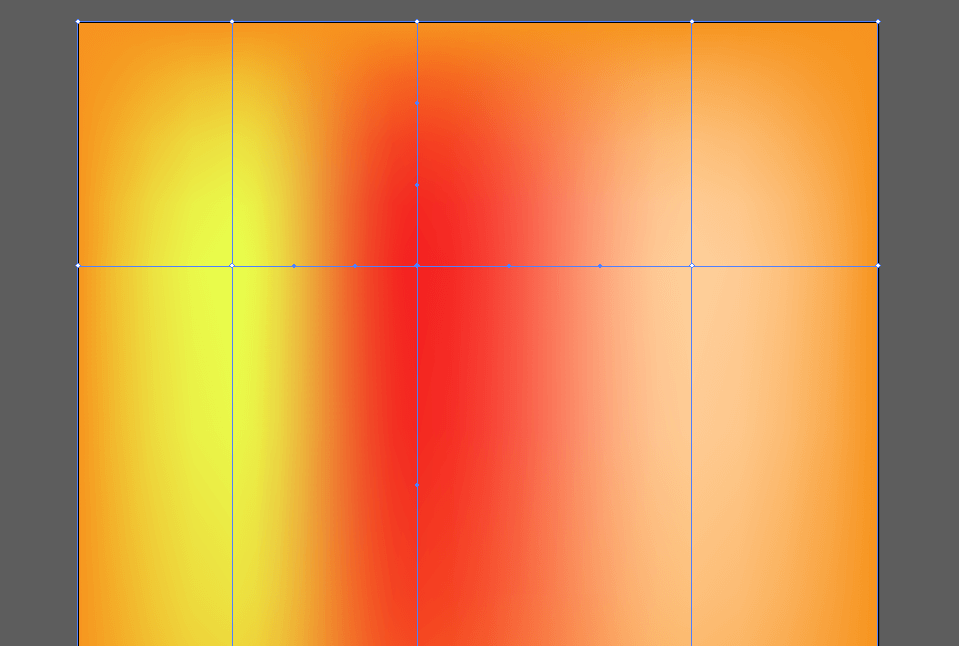
It depends on your needs to attach further information. Each grid point can be moved by simply dragging it to adjust the color contrast.
Fluid color is flexible so it’s crucial to keep it basic and not be overboard. It is preferable to use three to five colors, and an understanding of the color theory will help you create an impressive final result. Play with various colors, seek to use the gradients in the context to figure out what fits best for you.

If you want to have the expected good impact on your gradients, you just have to learn about your audience and what kind of designs they ‘re going to react to. In our case, the hiring poster is designed to hire a graphic designer, and the concept of creative fluid color design will be attractive and reasonable for attracting attention from those designers.
Poster Content Adjustment

White color on the font text is added to create a new feel for the audience. However, we need to be mindful of the readability of the font which may interfere with the color of the context. A drop shadow effect on the font is used to overcome the color problem and bring back the dispute to the background colour. One can be found at Effect > Stylize > Drop Shadow …
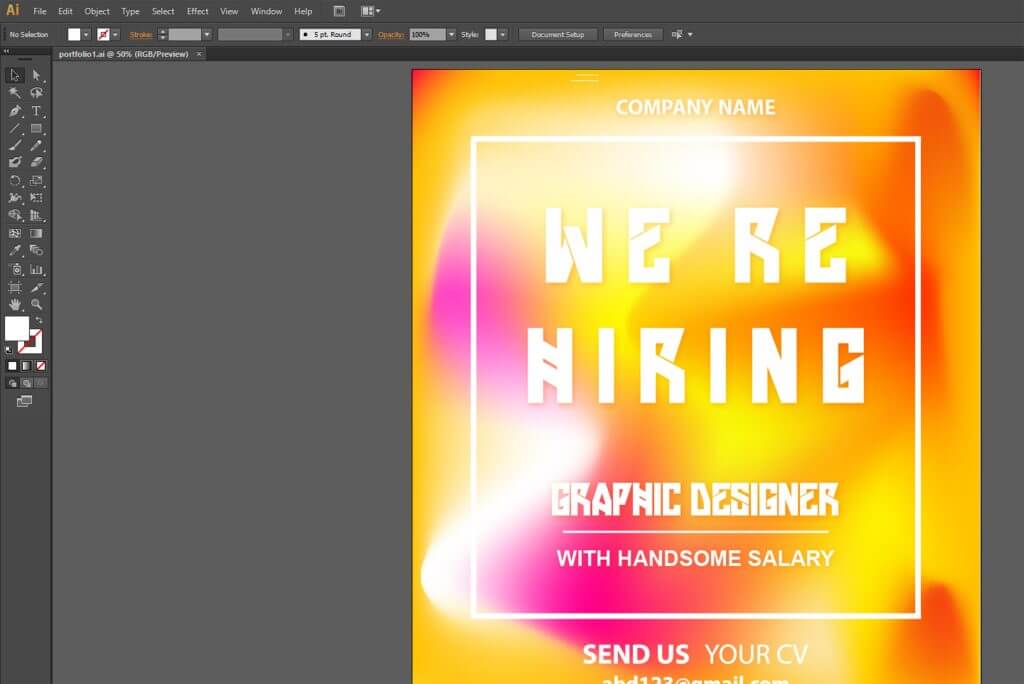
Finally, the hiring poster design is completed and be ready to use.
