I have handled a website design optimization project for an international college since I joined the college as a full time web developer. Before I involve into the project, the college website is built halfway and many pages still under implementation. Therefore, this post will show you how was the website looks before I optimize and revamp the design.
Home Page Navigation Menu & Slider
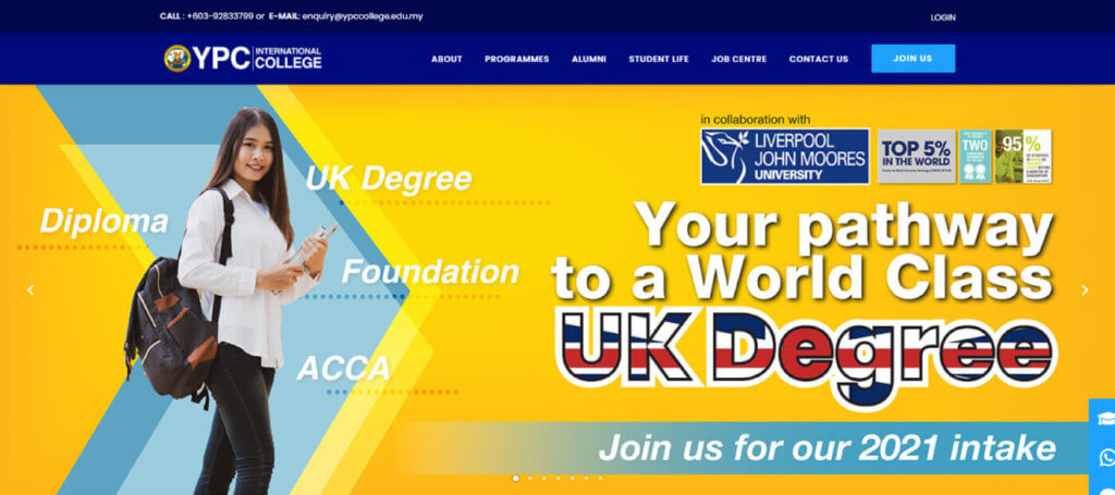
Color always is the most important element for every design. In this case, I revamp and change the main color of the website. In Figure below, the website’s blue is using the CMYK color model which is suitable for printing. However, this blue color is not necessary to used for website design. You may notice that the overall design of the website menu & slider section (before) is boring and looks like a printing banner.
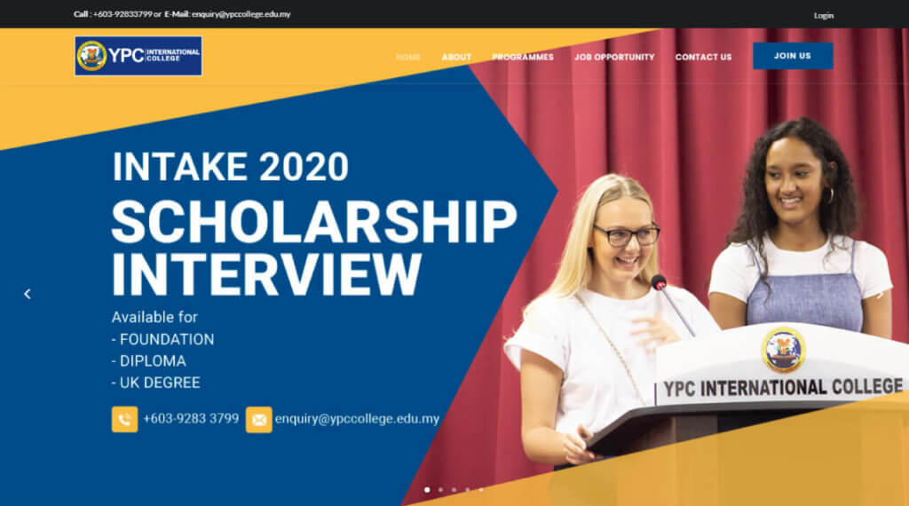
After a few discussions with colleagues, we have decided to used a strong blue color #000B7A to replace the previous blue color. Therefore, I replace the transparent menu bar with the solid blue color background to emphasizes the corporate color.
Next, the size of the banner is an issue for the home page design. Some of the PC monitor resolution cannot display the full view of the banner slider with 1350 x 708 pixels. All the following banner images were adjusted to 1400 x 508 pixel (for desktop) and 650 x 800 pixels (for mobile).
A secondary color #1EA1FA (light blue) is picked as the color for all buttons.
Home Page Programme Section
Programme section is a important section in a college website which will show the overall programmes provided. Previously, the programme section of YPC website displays 3 education levels which are foundation, diploma, and UK Degree as shown in Figure below.
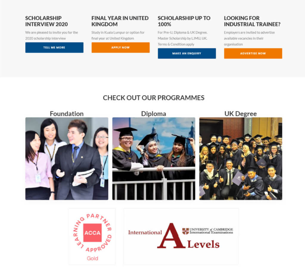
After a brainstorming with the creative director, I revamped the programme section by elements such as typography, font color, image, and animations.
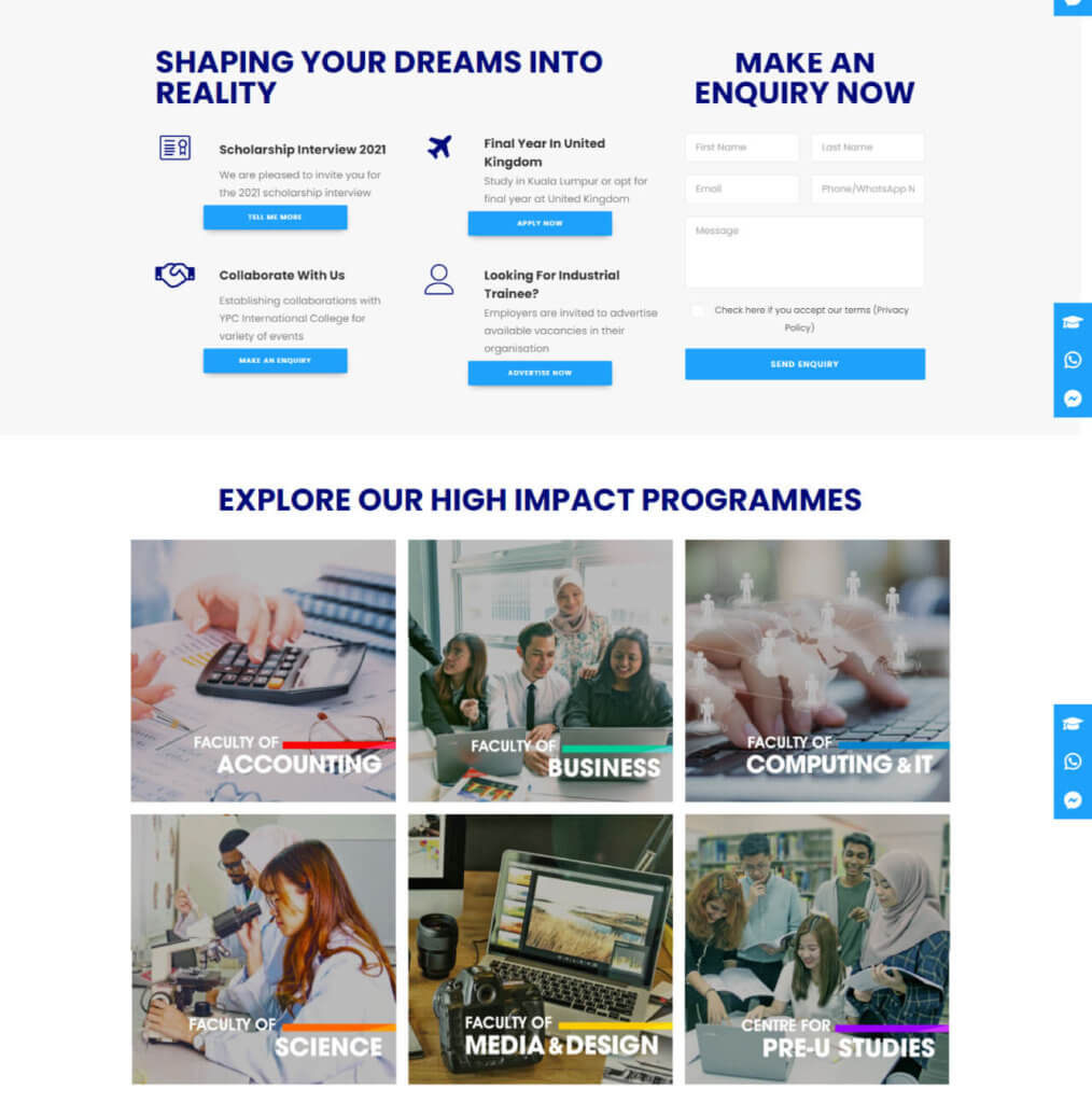
Figure below show the programme section after the website design optimization. All the courses are designed and separated into 6 faculties to provide a simple way for the user to navigate. The headline using 900 font weight to emphasize it.
A contact form is inserted for visitor to submit their enquiry. The 4 features from the previous section is optimized by changed the button color to the light blue and an icon was added according to the feature.
Faculty Page Design Optimization
Lastly, the design of the faculty page has improved. At the first, the overlay color of the hero banner section changed from red to black. I tried to make the page looks professional and not over emphasized the faculty’s color.
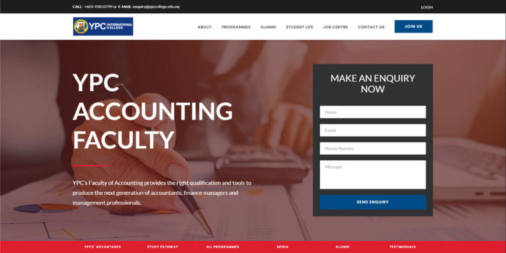
Therefore, the background color of the contact form changed from dark grey color to dark blue to make sure the theme color is integrated.
You will realize why the red color in the faculty of accounting page feel bored. This is because of the incorrect use of the color mode between CMYK and RGB. I modified the color code of the CMYK red to RGB red (#ff0000) and the overall page design looks more attractive.
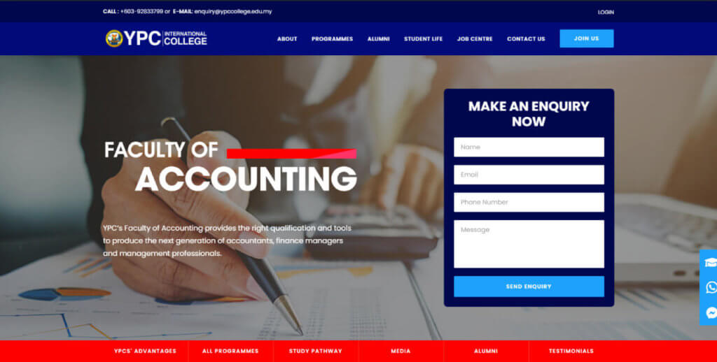
At last, the faculty page design was optimized as showed in Figure above. The blue and red colors were combined in the homepage design optimization without overwhelming it.
Conclusion
There was one element that all successful websites shared in general. They all had their own individual style that mirrored the firm they worked for. Despite the same layouts, the colors, typefaces, banners, and designs were all consistent with their products and businesses. These tips of website design optimization is useful to me and helped to revamp the design of the international college’s website perfectly. Check out how I implemented SEO strategy for the college website to improve the online presence.

