Firstly, the business owner is dissatisfied with the current website landing page design and is encountering website conversion issues throughout the ongoing Facebook Ad campaign. After completing platform research, I propose that the client landing page design optimization before increasing his Facebook Ad campaign budget for the following season.
A landing page is a separate web page designed expressly for a marketing or advertising campaign in digital marketing. It’s where a visitor “lands” after clicking on a link in an email or an ad from Google, YouTube, Facebook, or another comparable website. To achieve the project objective, I have to make sure the landing page is designed with a single goal, which is CTA (call to action) and collect the lead.
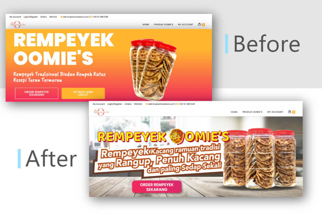
Before
The landing page was simple and clean. Top menu navigation followed by the super-clear headline, followed by more detailed feature descriptions and a 2 CTA buttons. All this was illustrated with a hero cookie product image depicting the look and feel of the crunchy and tasty.
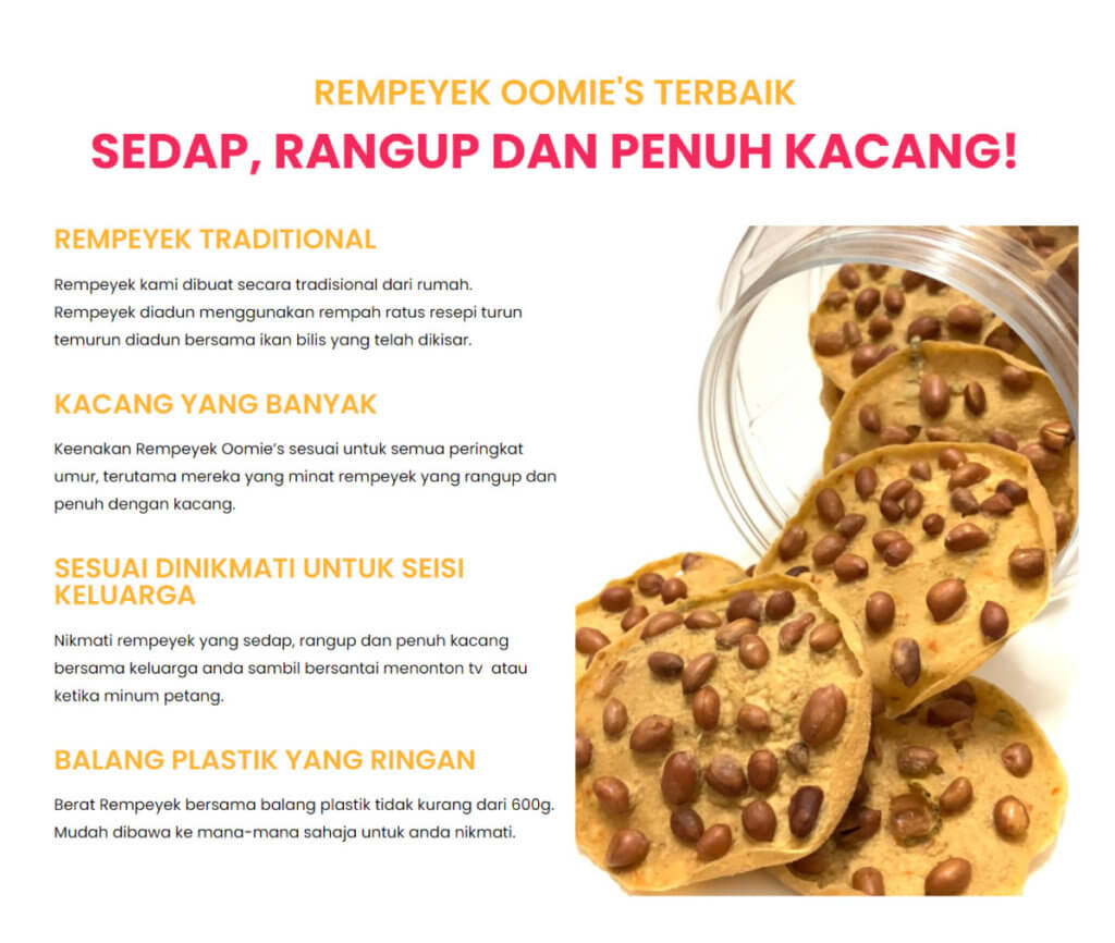
In the product feature section, there are 4 main selling points and a long vertical cookie photo at the right. However, this is not user friendly when the visitor scrolling the landing page in a mobile view.
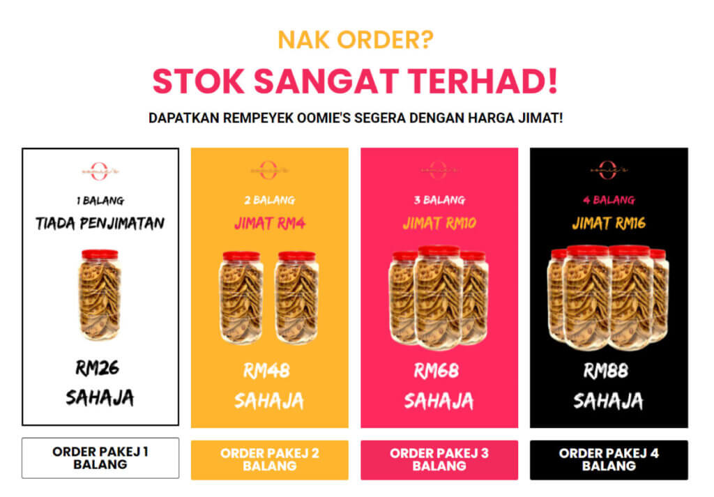
4 color were used to represent each variation of the cookie products in the product section. The user could click through the CTA button to proceed to the checkout page for payment process.
After
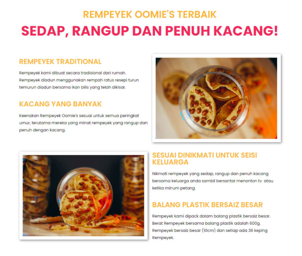
To begin with, the landing page is now completely responsive, which means that the information and elements adjust automatically to match the user’s display in both desktop and mobile view. 2 professional product photos were applied in the feature section to enhance the real look of the product.
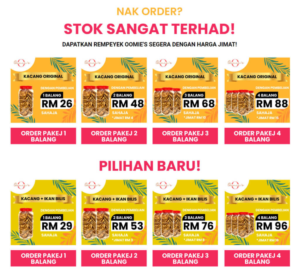
The most important section to concentrate on is the product section. A new design of the product variation is applied and arranged in a row, with highlighted product quantity, price and CTA superimposed.
The use of space is effective, since the product picture falls short of the fold and material farther down the page may peep out, enticing the visitor to scroll down. An beautiful animation effect is triggered when scrolling into this area.
Overall, the landing page makeover improves the user experience while maintaining the brand’s identity.
Conclusion
Landing pages must be user friendly and lightning speed to maintain a high conversion rate. Overall, the Oomie’s landing page makeover improves the user experience while maintaining the brand’s spirit.

