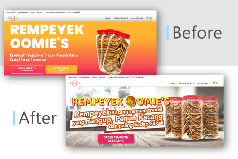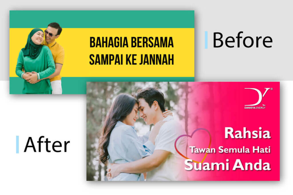
A landing page is any web page that a customer may arrive on, but in marketing, it’s generally a standalone page, separate from your homepage or any other website, that serves a particular and focused goal. A landing page serves as a follow-up to any promises made in your content. Here is a case study of design optimization for an E-book Sales landing page.
I have handled a landing page design optimization project for an E-book business. Before coming to me, the customer already had a landing page for the E-book which is created by another agency. The customer mentioned that the previous landing page color theme (green) is not suitable to the e-book topic.
A few improvements has been made to the client’s landing page design after we have a deep conversation.
Before
A strong landing page has only one goal: to get visitors to do the one action you want them to take and convert. This is why many landing pages lack menus. You want your visitor to complete the call to action or do the purchase rather than wander away or become sidetracked.
It’s basically an combination of adding crucial element and carrying them out correctly.
Headline – Make sure your headline is clear and complements your campaign. The message of your advertisement and headline should not be too dissimilar. Visitors to your site will be confused if there is a disparity between the two.
Image – High-quality photographs that match, rather than detract from, the content on your landing page. Choose an eye-catching design to appeal to the 40 percent of people who respond better to visuals.
Call to action (CTA) – The finish line of your landing page. Make it visible and appealing. A large flag and complimentary champagne would be wonderful.
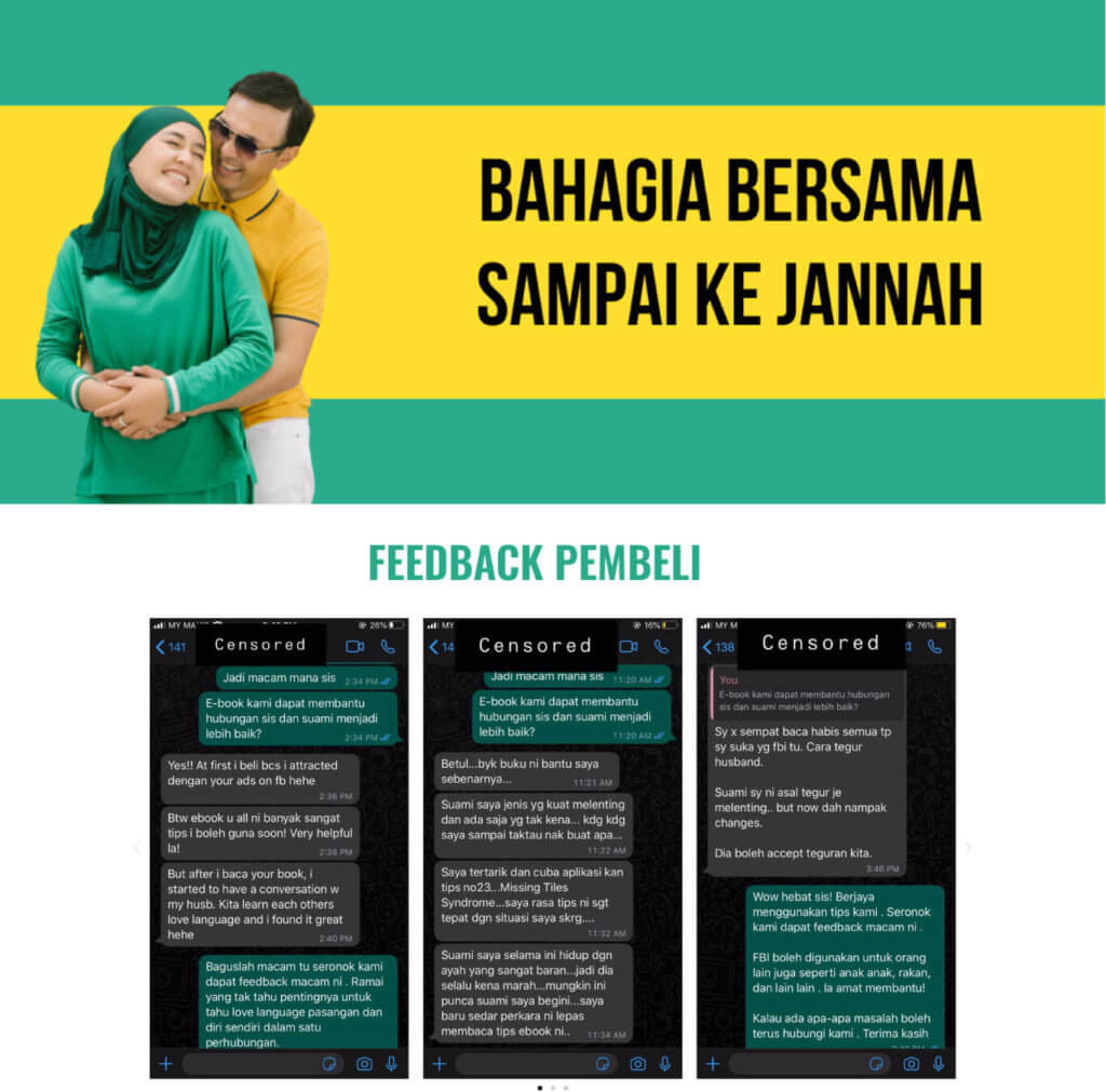
Before the optimization, the landing page banner image was designed in a combination of yellow and green color. It is not strong enough to catch audience’s attention and prompt visitor to take action. The testimonial section is not in the right placement after the banner. Product or service feature should be displayed to the visitor before a testimonial is showed.
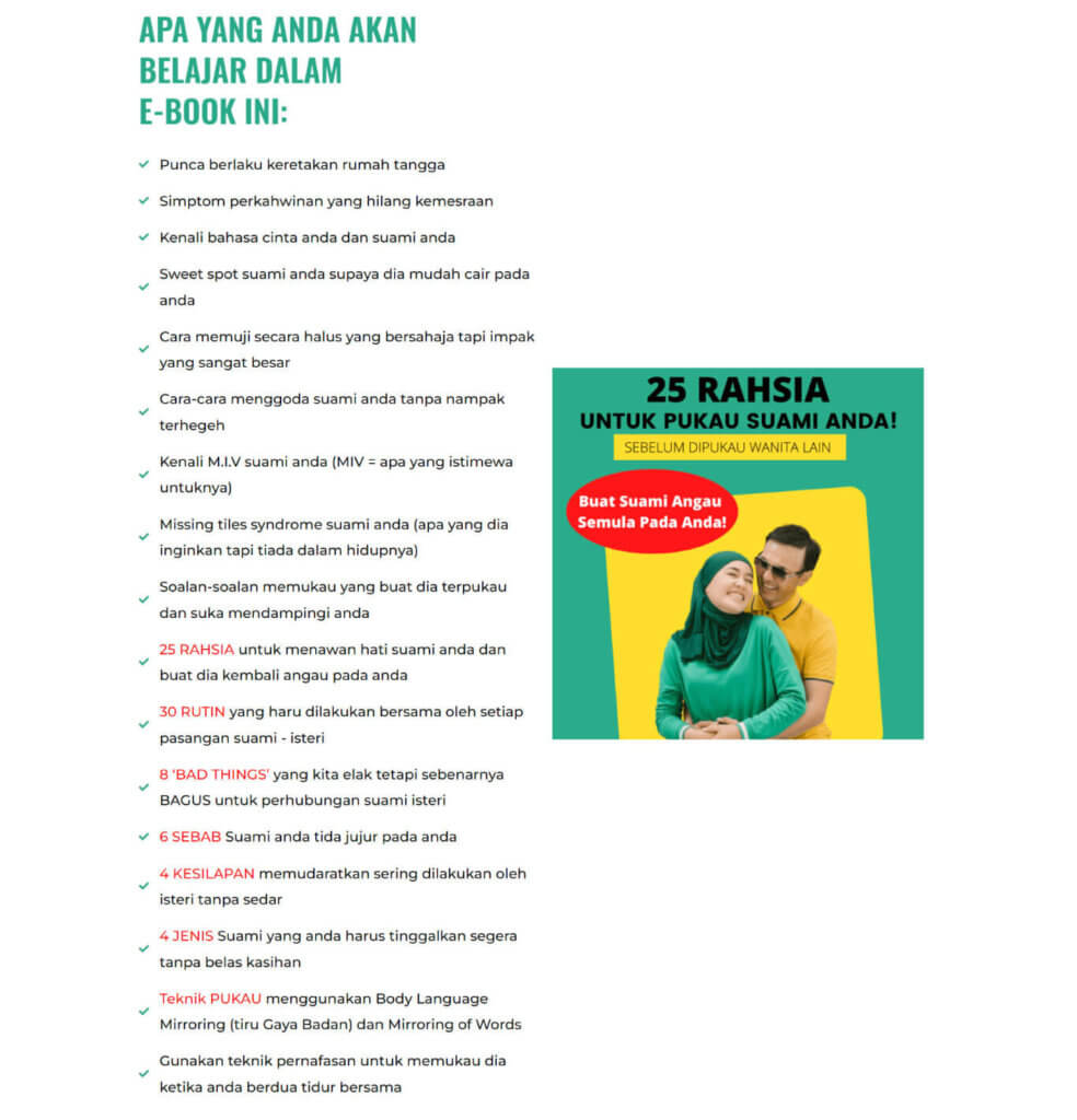
The book description is written in a lengthy way. This may make it difficult for the visitor to grasp the e-book feature clearly.
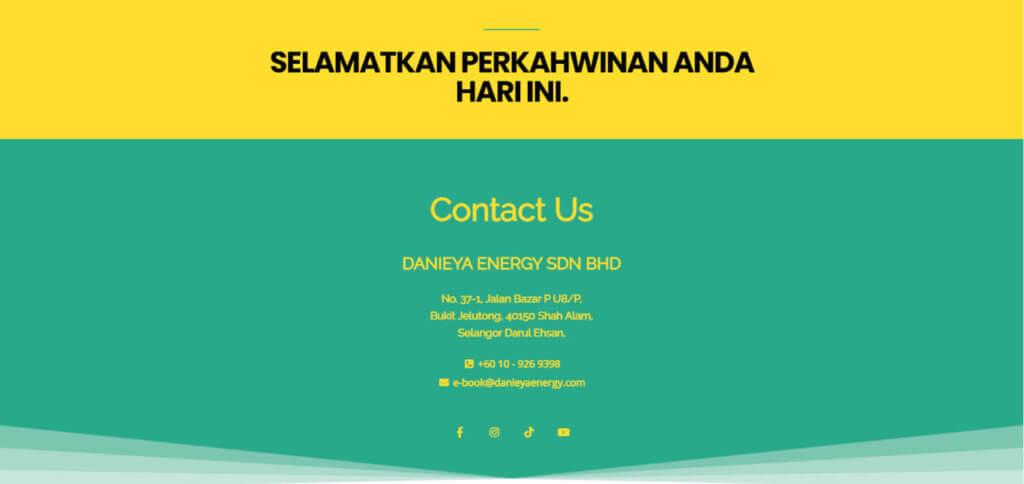
The font in the footer section used yellow color with green color background make it difficult to read.
After
Customize and customize your landing page so that your consumer can follow a coherent story. A strong headline is a must in the landing page banner section.
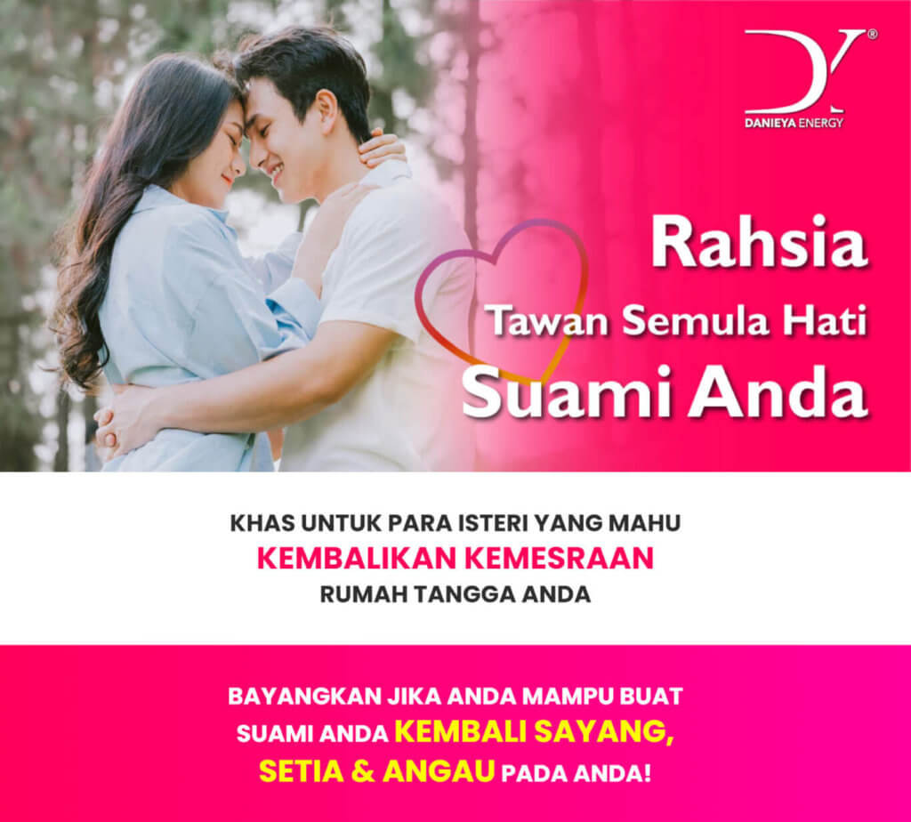
The main color of the landing page replaced by bright pink to attract visitor’s attention. Highlighted text (yellow font color and bigger font size) is necessary to show up the main words of the sentence.
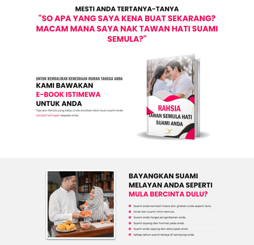
An E-book mockup was designed for the landing page to provide the visitor an expectation after they purchase a “book”. The feature points of the product was separated and designed into few sections to provide a better understanding to the visitor.
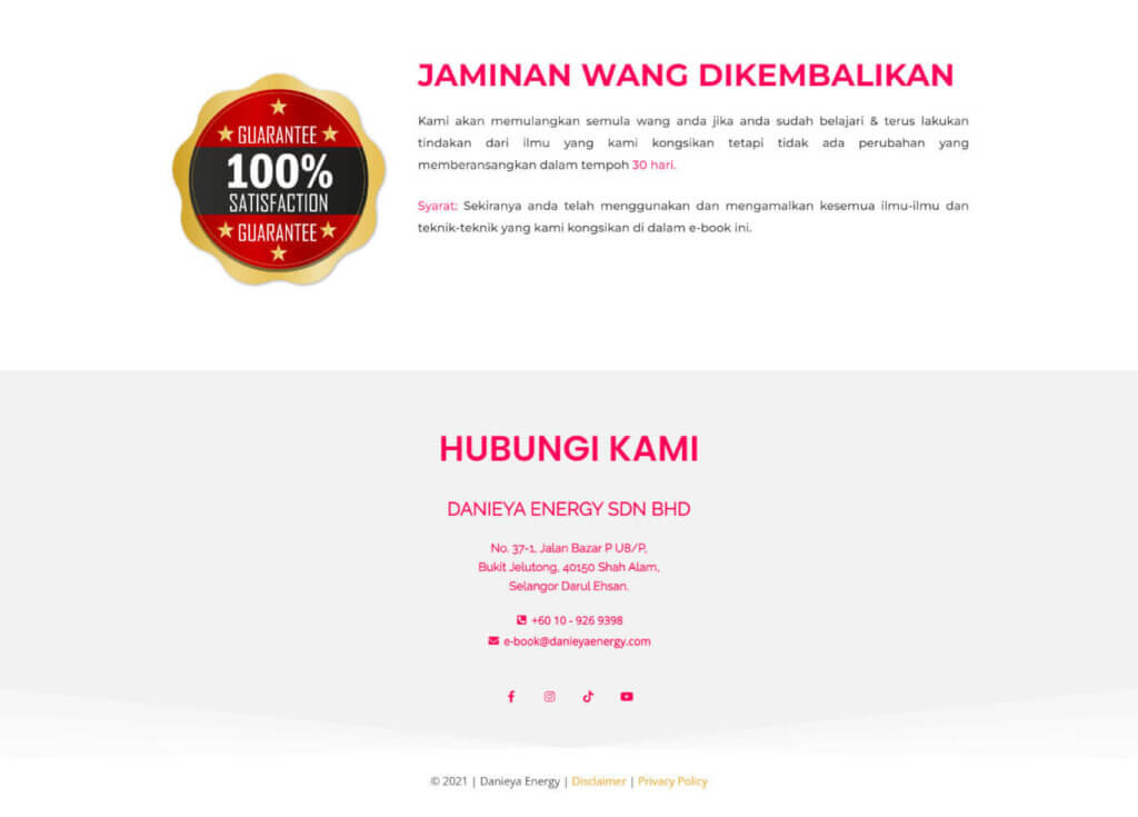
A new section “Jaminan Wang Dikembalikan” is added above the footer.
They are frequently employed as a marketing tool since they provide buyers a sense of security when acquiring a new product. A basic money-back guarantee specifies which products or services are covered by the guarantee and the period for returns.
The color combination of the footer is changed as shown in Figure above. The bright pink color is applied into the font with a light grey background to make sure it won’t overwhelm the landing page color theme.
Conclusion
In conclusion, the client is satisfied with the design outcome and the landing page perfectly met their requirement. It is necessary to combine a sense of design with an awareness of how humans interact when exploring the web in order to create beautiful, successful landing pages.
Get the best of both worlds when developing your next landing page by paying attention to CTA positioning, acquiring product photographs and graphics, balancing header language, and ensuring your design components both look nice and drive conversions.

