In mobile marketing, it’s easy to fall into the trap of common assumptions. One prevalent belief is that users with low in-app currency balances, are “low engaged users” who will always have a low Click-Through Rate (CTR).
We held this belief, too, but a series of A/B tests challenged our thinking. The results were surprising. We discovered that “low engaged users” are not always synonymous with low CTR.
This article shares four key, data-backed lessons from six push notification experiments that can help any marketer optimize their strategy and better resonate with their audience.
Lesson 1: Personalization Trumps Social Proof for Unengaged Users (Test 1)
The Hypothesis: Our team’s starting assumption was that users with a low S-Coin balance were low-engagement users with low CTR, while high-balance users were active and engaged, leading to high CTR.
| Header | Body | CTR | Style |
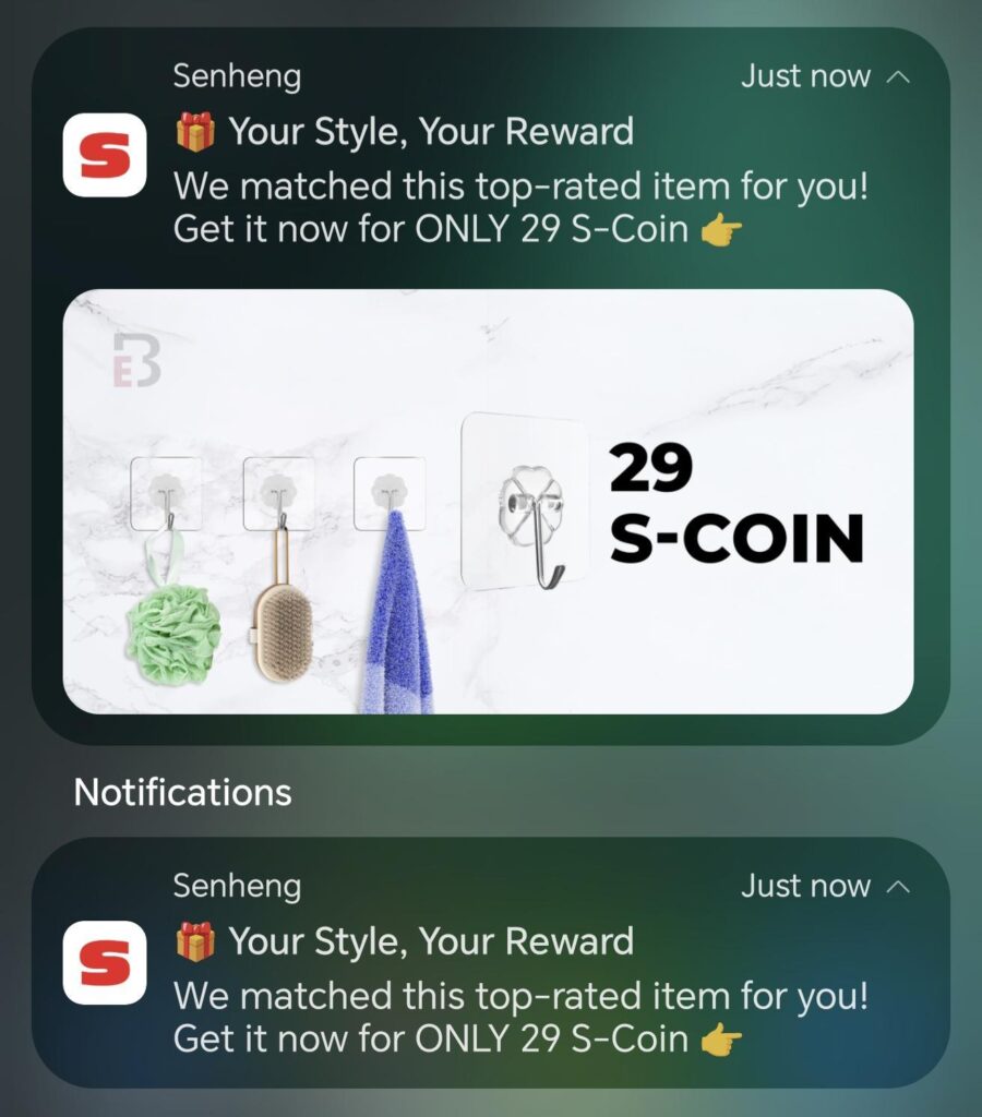
| ✨ Unlock Your VIP Reward | Congratulations! You’re invited to redeem this reward with 496 S-Coin > | 4.42% | Personalization |
| ✨ Unlock Your VIP Reward | Congratulations! You’re invited to redeem this reward with 6,160 S-Coin > | 5.70% | Personalization |
| 🔥 9/10 People Love This Reward | This popular reward is trending now! Redeem with 4,225 S-Coin > | 1.62% | Social Proof |
| 🔥 9/10 People Love This Reward | This popular reward is trending now! Redeem with 21,990 S-Coin > | 2.06% | Social Proof |
| 🔥 9/10 People Love This Reward | This popular reward is trending now! Redeem with 28,000 S-Coin > | 1.90% | Social Proof |
The Test: We segmented our users by S-Coin tier. We sent a “Personalization” style caption (e.g., “✨ Unlock Your VIP Reward”) to the lower S-Coin tiers (2,500 – 15,000). For the high S-Coin tiers (15,000 – 200,000), we used a “Social Proof & FOMO” style caption (e.g., “🔥 9/10 People Love This Reward”).
The Surprising Outcome: The results were “out of expectation”. The low S-Coin tiers, who received the personalization-style message, achieved their highest-ever CTRs, ranging from 4.42% to 5.70%. Conversely, the high S-Coin tiers, who received the social proof message, had a lower CTR than we expected (1.62% – 2.06%), which was below their usual average of 2.5% – 4%.
The Takeaway: This test was a powerful reminder that “low engaged users is not always = low CTR”. By using the right style of caption—in this case, personalization—we were able to resonate with them.
Lesson 2: When in Doubt, Use Text-Only (Tests 2, 3, & 4)
It’s a common belief that a rich push notification with a banner or product image will always outperform plain text. We tested this hypothesis three times, and the results were consistently in favor of text.
The Tests: We ran three separate experiments to see how a banner would affect CTR.
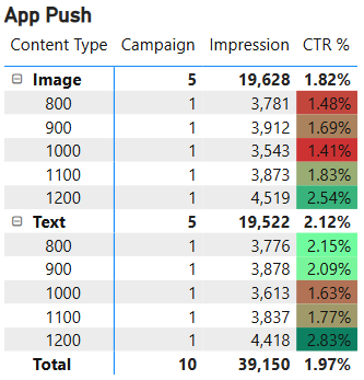
- Niche Products (Test 2): We tested Image vs. Text-Only notifications for products that sold less than 5 units. Overall, Text-Only won with a 2.12% CTR compared to Image’s 1.82% CTR.
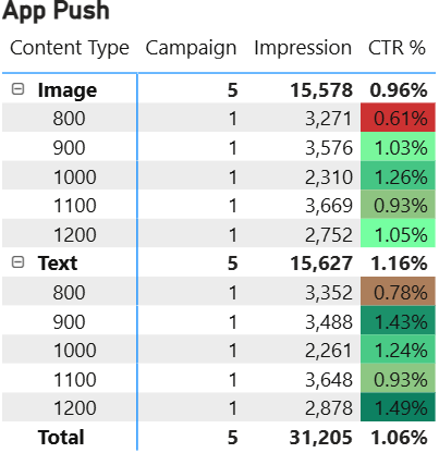
- Top-Selling Products (Test 3): We repeated the test, this time using top-selling products. The results were very similar: Text-Only won again. While the gap was closer (1.16% vs 0.96%), Text-Only still performed better.
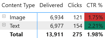
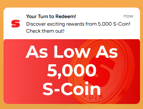
- General Text Banner (Test 4): We tested a simple Text-Only notification against one with a text-based banner (e.g., “As low as 1,000 S-Coin”). Once more, Text-Only outperformed the banner version, 2.21% vs. 1.75%.
The Takeaway: Text-Only consistently performed better because it creates curiosity. Users don’t know the product and are “willing to discover” it. An image, on the other hand, immediately reveals the product and price, which may not attract users who aren’t interested. In the case of the text banner, the image added no new information, creating a “disjointed and confusing experience”.
Lesson 3: Keep it Clean and Personal (Test 5)
The Hypothesis: We wanted to test if adding numbers to the header or using emojis would grab user attention and improve CTR.
The Test: We ran an A/B test on users with over 2,500 S-Coin. We tested two variables:
- Emojis in the caption vs. No Emojis.
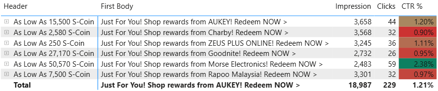
- A header with numbers (e.g., “As Low As 15,500 S-Coin”) vs. a personal header (e.g., “Just for YOU”).
The Outcome:
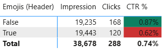

- No Emojis won: Captions without emojis had a significantly higher CTR of 0.87% compared to 0.62% for captions with emojis.
- Personal header won: The “Just for YOU” header achieved a 1.33% CTR, while the various headers starting with numbers had an average CTR of 1.21%.
The Takeaway: The conclusion was clear: users with S-Coin balances preferred push notifications that were “Clean & easy to read”. A personal, simple message like “Just for YOU” in the header was more effective than a header loaded with numbers, proving that numbers in the header do not always equal a high CTR.
Lesson 4: Frame Your Offer as a Starting Point (Test 6)
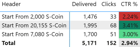
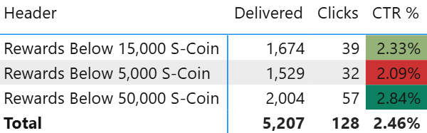
The Hypothesis: How you frame your offer matters. We wanted to know which caption would perform better: “Rewards Below xxx S-Coin” or “Start From xxx S-Coin”.
The Test: We targeted users with S-Coin and tested these two caption styles against each other.
The Outcome: The “Start From xxx S-Coin” caption outperformed its counterpart, 2.94% vs. 2.46%.
The Takeaway: People are more likely to tap when they see a low entry point. The “Start From…” message “instantly communicates affordability and lowers perceived commitment”. Conversely, a price ceiling like “Rewards Below…” doesn’t feel exciting and may even register as expensive, which can reduce engagement.
Conclusion: Your New Rules for Push Notification A/B Testing
These six experiments provided us with four counter-intuitive but powerful lessons that have reshaped our push notification strategy:
- Re-engage “lost” users with personalization. Don’t assume low-balance users are a lost cause; they may just be waiting for a message that resonates.
- Default to Text-Only to drive curiosity. An image isn’t always better and can sometimes hurt CTR by revealing the product too early.
- Prioritize simplicity. Users often prefer clean, easy-to-read messages over cluttered notifications with emojis or redundant numbers.
- Frame your value with a low entry point. “Start From…” invites users in, while “Rewards Below…” can feel like a limit.
Stop guessing and start testing. What you find might surprise you.