A travel website is one that offers either travel reviews or trip fares, or a combination of the two. I had an opportunity to engaged with a customer from tourism industry to handle the website design optimization. The customer wanted to re-imagine the web design and overhaul its website in a professional and better look.
The home page of the website has been highlighted as an area of opportunity. The most significant component of the website’s main page to redesign is the banner section.
Website Banner
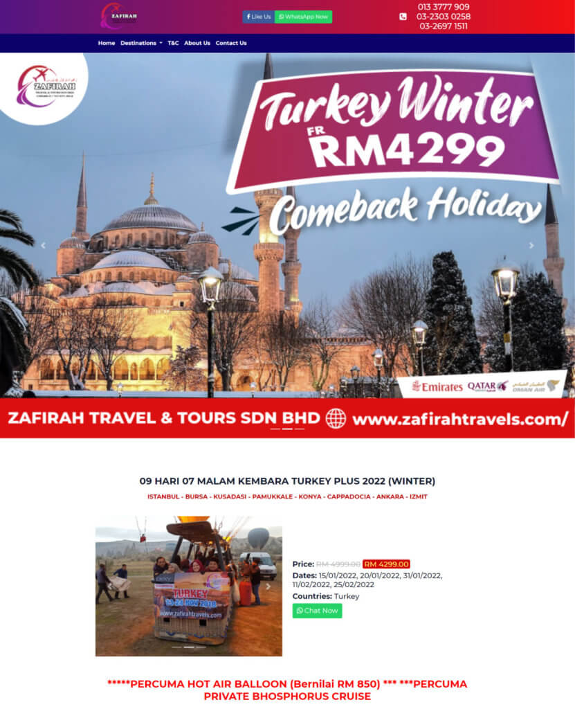
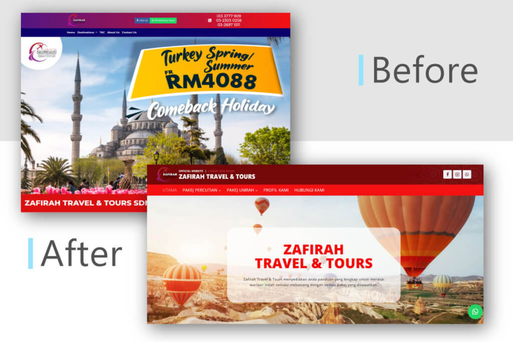
Before revamp the website, the website banner is a static image and the text is merged into it. This caused the text display issue between the desktop device and mobile device.
The design of package description is an another part to revamp. Instead of display the package booking dates in this section, the booking time schedule is pull out and make it as a new section in the web page.
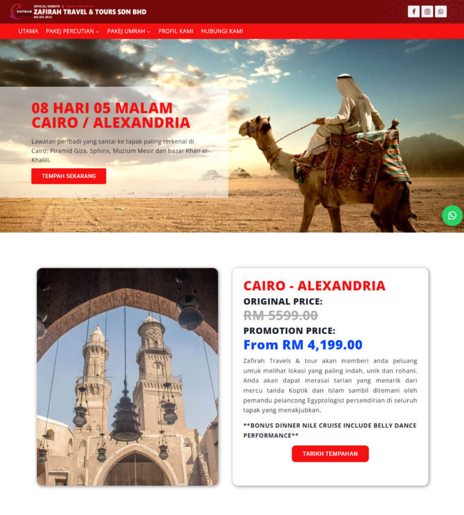
The website banner was revamped as showed in Figure above. The idea is to improve the text readability and become responsive between desktop and mobile device.
The customer wanted to make it easier for visitors to navigate and find new material by simplifying the design. They also wanted to offer a more curated content experience, with space to display the package content that they had hand-picked.
Packages Section
Packages section is a part of the website that listed few main travel packages to promote. It is not only show the photo of the featured place but also the package pricing.
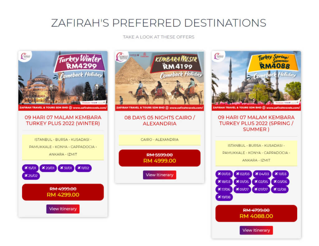
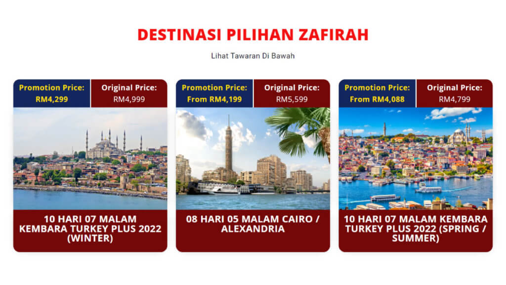
The package section before the optimization applied the combination of 2 colors which are red and purple. After a discussion with the client, we changed the color of layout into the main color which is bright red.
Therefore, the promotion price and original price of each package are highlighted with applying different color. The combination of dark blue background color and yellow font color was applied to the promotion price to catch the visitor’s attention and create a premium looks.
Website Footer
While footers attract less attention than the top of the page, they are still used for all websites frequently. Whatever text ends up in the footer in each of these scenarios, it should be consistent, predictable, and easy to find.
In the past, website footers were either little utility spaces with limited information or large dumping grounds for random connections. They frequently had tiny text that was difficult to read. Footers have evolved over time and now serve as a useful reference point for users while they complete various tasks on websites.

The previous version of the website footer applied a gradient color as the background. This is not a good practice as it will affect the readability of the text in the website footer.
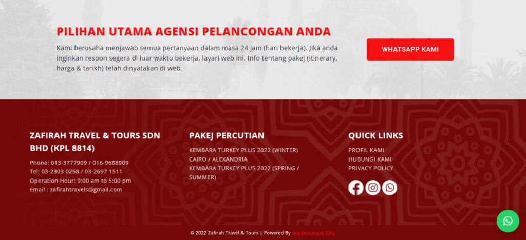
The footer is now separated into three main categories: business information, packages, and quick links, following a redesign. For the visitor’s convenience, more company information has been added.
Conclusion
I discovered a pattern when researching my field in the website design. All successful websites had one thing in common. They all had their own distinct style that reflected their company. Although the layouts were similar, the colors, fonts, banners, and designs were all consistent with their products and brands.

