At the beginning, the client is facing website conversion issues and looking to improve the user experience of the website and brand identity. After an investigation through the platform, I suggested the website design optimization is necessary before the company going for any marketing campaigns.
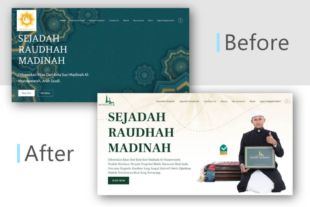
The previous appearance of the muslim prayer mat E-Commerce website was a poor designed as shown in Figure above. A background banner in the home page with islamic vector graphic emphasising the store value propositions to their customer: islamic, simple, and green color was the major UI element.
To make sure the core value is remained in the whole website design optimization process, I have understand the client’s requirement and their main products in the E-Commerce store.
Before
The website logo is poorly positioned in the corner of the website, which is without remove the white color background.
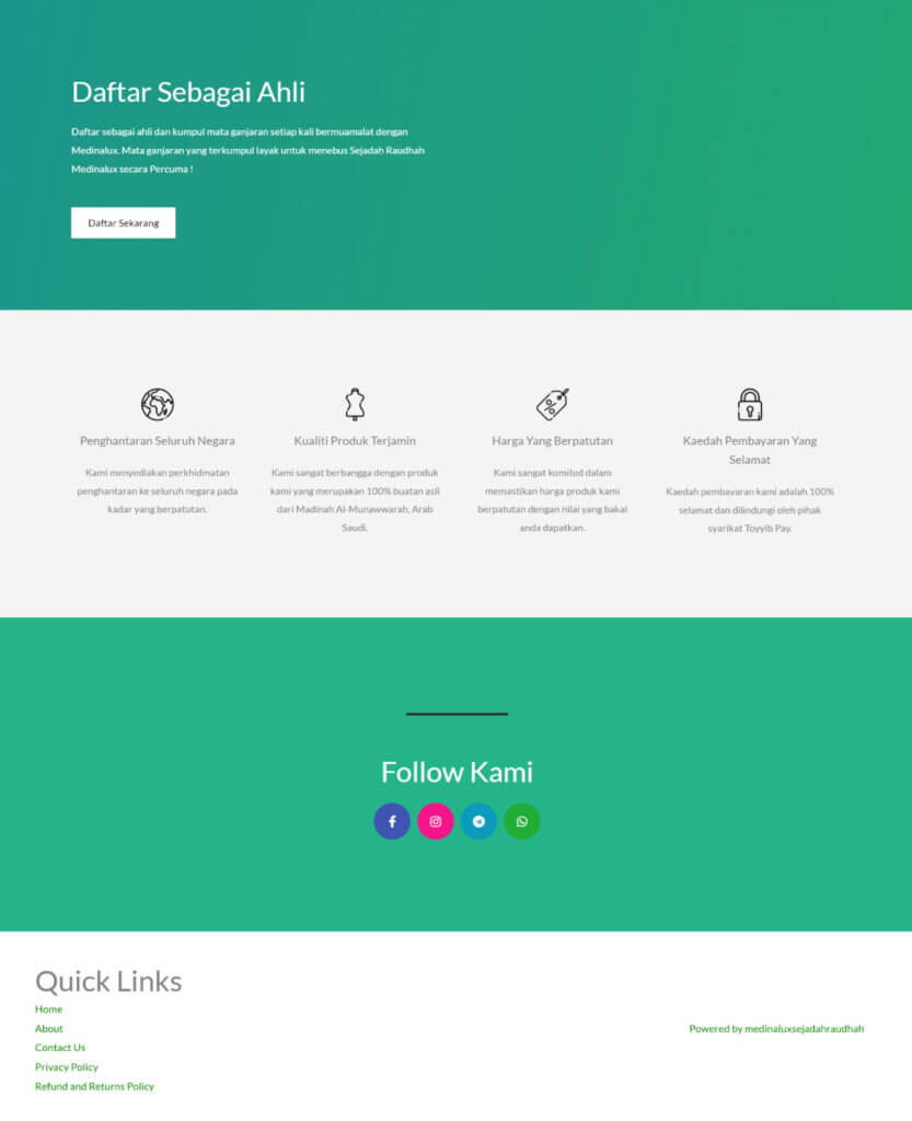
In the other side, there are only few links included in the footer of the website and not well structured. Footer plays an important role in the website which tells the visitor that this is the end of the web page. Most of the websites provided very clear navigation and company contact information in the footer section.
The primary color in the website is not picked in a correct way. This will cause the website looks not in professional manner and some will affect the readability of the font.
After
The new version of the E-Commerce shop home page foregoes the graphic backdrop and the retro pictures and header in favor of a modern, clean appearance.
The page begins with a straightforward, strong value proposition before diving into the major product category with a quick description, basic price information, and a call to action.
Even better, the banner section have modern-looking, colorful, organic designs and a little animations that catch the eye and entice the user to click on the CTA.
Therefore, the footer design of the website was revamped with the main color I picked up for the client. This dark green color was implemented into whole website, not only the home page but include the product page font, icon and theme color.
I separated the footer content into 4 columns which are company information, product categories, quick links, and social media channels. This will allow the visitor to navigate through the website easily.
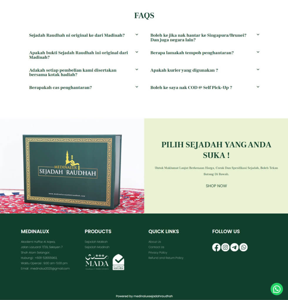
Last but not least, a FAQ section is added to the website main page to give additional information to visitors and improve overall user experience.
Conclusion
Overall, the website design optimization is a big success in terms of user experience (UX). A lighter, more contemporary website appearance is supported by better navigation, a clearer value offer, and excellent color utilization. It is not only improve the brand identity but also the trust worthy of the customer to purchase product within the website.

